I watched a guy on YouTube go through and judge a shit load of the submissions and I wish I could remember if he saw this one. Though I doubt it because there was an ungodly amount. This one definitely more aesthetically pleasing than the old one.
Cool! I read through the related articles after seeing your comment and yeah that’s what it looks like to me as well. Weird that they didn’t just…design their own if they weren’t going to pick an submitted design wholly but I also understand sometimes you need guidance to an idea then you can spring off of it to land with what you wanted but didn’t know how to get there. Lol. Regardless, I like it a lot especially compared to the old one. I live in a “seal flag” state and I hate it they’re so busy.
Edit: sorry my app was having issues and I replied multiple times!
Yeah, I’m also in a “seal flag” state. Kansas, specifically. Our flag is so indistict, they had to write Kansas on it so you could tell it from the ten other flags that are just the state seal on a blue field. Hopefully we’re next in line for a redesign.
I do love my city flag (Wichita), though. It’s everything you could want in a flag.


It will be next year.
I watched a guy on YouTube go through and judge a shit load of the submissions and I wish I could remember if he saw this one. Though I doubt it because there was an ungodly amount. This one definitely more aesthetically pleasing than the old one.
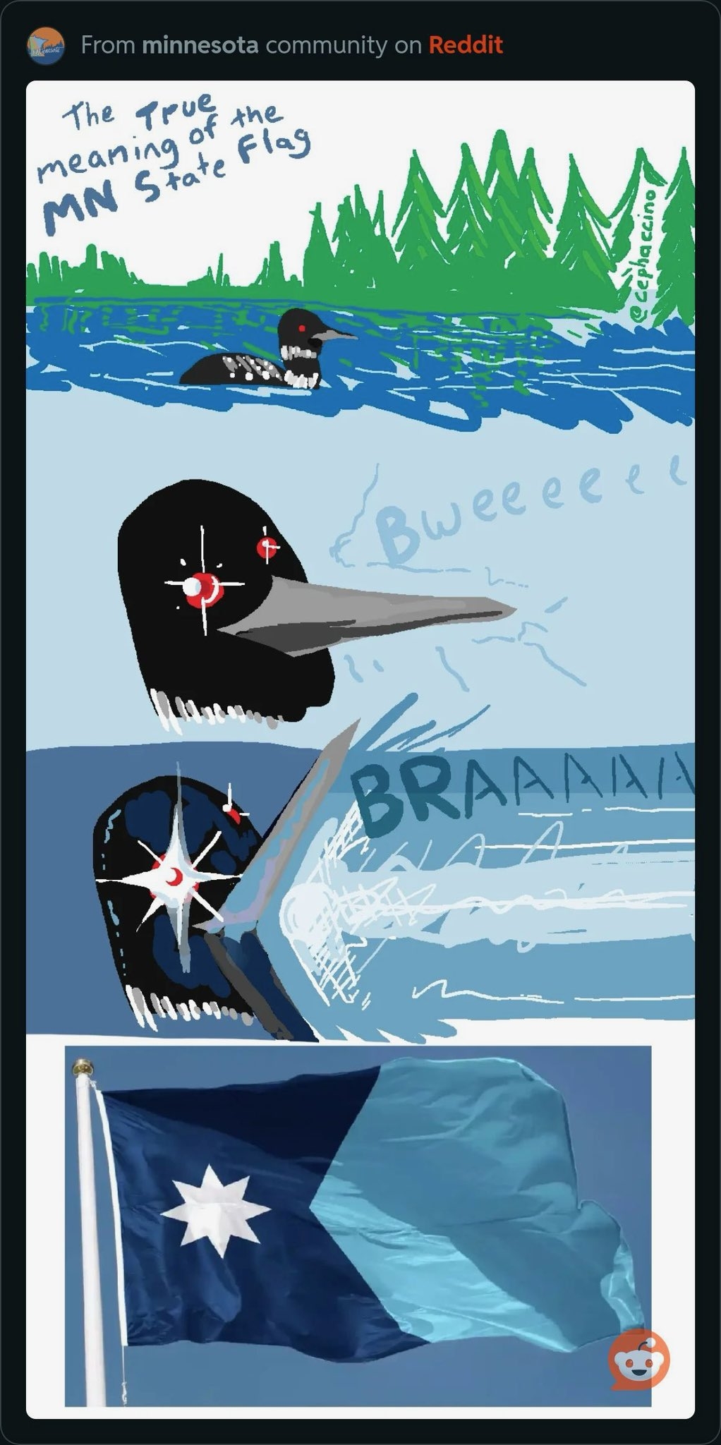
If I understand right, this isn’t exactly any of the submissions, but it’s a reworked version of one.
The version submitted had blue, green, and white stripes on the right side, and a different star shape on the left.
Cool! I read through the related articles after seeing your comment and yeah that’s what it looks like to me as well. Weird that they didn’t just…design their own if they weren’t going to pick an submitted design wholly but I also understand sometimes you need guidance to an idea then you can spring off of it to land with what you wanted but didn’t know how to get there. Lol. Regardless, I like it a lot especially compared to the old one. I live in a “seal flag” state and I hate it they’re so busy.
Edit: sorry my app was having issues and I replied multiple times!
Yeah, I’m also in a “seal flag” state. Kansas, specifically. Our flag is so indistict, they had to write Kansas on it so you could tell it from the ten other flags that are just the state seal on a blue field. Hopefully we’re next in line for a redesign.
I do love my city flag (Wichita), though. It’s everything you could want in a flag.
deleted by creator
deleted by creator